

Chance of Success Score: What Your Score Means and How We Get It


Your plan says 85%. That number sits right at the top of your Ready Aim Retire dashboard, and honestly, it probably carries more weight than anything else you look at. It's the number you read out loud to your spouse over dinner. It's the number that decides whether you hand in your notice at 62 or grind out three more winters.
So let's talk about where it comes from, what it can actually tell you, and what it definitely cannot.
- Your Chance of Success score counts how many of 106 real 50-year stretches of U.S. market history your plan would have survived — a report card, not a prediction.
- It runs on actual historical sequences (the Shiller dataset, back to 1871), not randomly generated Monte Carlo returns.
- 80–95% is the target zone for most plans. Above 95% usually means you're underspending, not that you're safe.
- A "failed" simulation doesn't mean blindly running out of money — it means the plan would have needed an adjustment along the way.
- No method is perfect: the 106 windows overlap heavily, overweight certain decades, and can't test any 50-year retirement starting after 1976.
Bottom line: the score is a straight count of surviving historical windows, not a crystal ball — treat it as a diagnosis to investigate, not a verdict to obey.
Short version: your Chance of Success score is not a prediction. Nobody here owns a crystal ball. It's a report card on how your plan would have held up across every 50-year stretch of real market history we have data for. Not simulated history. Not randomly generated returns cooked up by a computer. What actually happened, in the order it actually happened.
Here's how it works, and why it spits out a different answer than the Monte Carlo engines running under most retirement calculators.
What the Score Actually Is
Start with the arithmetic behind your Chance of Success score, because it's way simpler than people expect.
Ready Aim Retire runs your plan through 106 separate simulations. Each one takes your starting balance, your contributions, your withdrawals, your Social Security, your taxes, your asset allocation, all of it, and pushes the whole thing through a different 50-year slice of market history.
At the end of each run, one question: did you still have money?
Count the runs that finished with a balance above zero. Divide by 106.
The Whole Calculation
If 90 of the 106 simulations ended with money left over, that's 84.9%, which rounds to 85%. Sixteen runs ran dry. Ninety didn't. That's it. That's the whole calculation. No black box, no proprietary volatility parameter, no analyst in a nice suit deciding what stocks will return over the next 30 years. The score is a straight count.
You can run these numbers for your own situation at ReadyAimRetire.com and see exactly which historical periods your own plan survives and which ones it doesn't.
The Time Machine
Most retirement calculators are asking some version of this: what might the market do over the next 30 years?
Historical simulation asks something completely different: what if you had retired in 1929? Or 1966? Or 1987?
Think of it as running your exact plan through a time machine 106 times, each trip dropping you off in a different year.
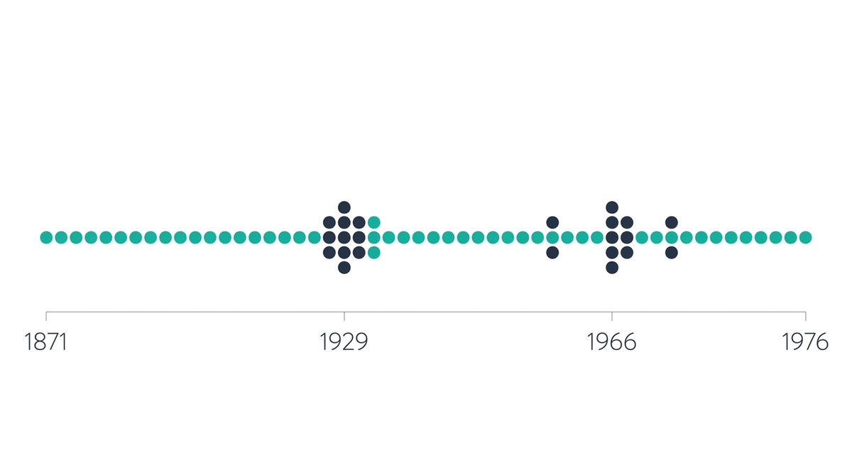
Simulation #1 drops your portfolio into 1871 and lets it ride to 1920, through the Panic of 1873 and the First World War.
Simulation #59 starts in 1929. Over its first three years the Dow falls from a September 1929 peak of 381 to a July 1932 low of 41. That's a decline of roughly 89%. Then your plan gets to survive the Great Depression on whatever's left.
Simulation #96 starts in 1966, which most people who study this stuff consider the worst year in modern American history to start a retirement. And here's the thing: not because of one dramatic crash. Because of what came after. Fifteen years of stagflation, where a portfolio could grind out roughly flat nominal returns while inflation quietly ate more than half its purchasing power. No headlines. Just a slow leak.
Simulation #106 starts in 1976 and runs to 2025, picking up the 1987 crash, the dot-com bust, 2008, and the 2020 pandemic drop along the way.
Almost every historical retirement failure traces back to two starting points: 1929 and 1966. That's what turns your score from a verdict into a diagnosis.
Now, when your score comes back at 85%, those 16 failures aren't scattered around at random. They cluster. That's more useful than the percentage itself.
Where the Number 106 Comes From
This is the part almost no retirement calculator bothers to explain, which is a shame, because you can check the math yourself in about ten seconds.
The Rolling Window Formula
Number of simulations = (years of data available) − (length of your plan) + 1
Your plan runs from age 42 to age 92 — that's 50 years. Plug it in: 106 = N − 50 + 1, which means N = 155 years of market data.
One hundred and fifty-five years of continuous market data ending in 2025 means the dataset starts in 1871. That's the Robert Shiller dataset out of Yale, the reference series sitting behind basically every serious historical retirement calculator, FIRECalc and FI Calc included.
Best part: the formula checks itself. FIRECalc tests about 125 sequences for a 30-year retirement using 154 years of data. 154 − 30 + 1 = 125. It holds.
Which also means your simulation count depends on your time horizon. The longer your plan, the fewer complete historical periods exist to test it against.
42-Year-Old, 50-Year Plan
≈ 106 simulations
62-Year-Old, 30-Year Plan
≈ 126 simulations
That's not a bug in our software. That's just arithmetic. But it has consequences, and we'll get there.
"Boldin runs 1,000 simulations. Isn't 106 kind of thin?"
This is the first thing people say, every single time, and I get it. But the two numbers aren't measuring the same thing.
Monte Carlo's 1,000 trials (or 10,000, or 100,000) are draws from a distribution that somebody assumed. You can generate as many as you feel like. Past a thousand or so, more trials mostly buy you precision around the assumption, not accuracy about the world. If the assumed distribution is off, running it a million times gets you a beautifully precise wrong answer.
A Fixed Supply, Not a Sample Size
The 106 historical windows aren't a sample size somebody picked. They're the complete supply of 50-year sequences that have actually happened. Nobody can manufacture more. Not me, not Boldin, not anybody.
So the real question isn't which number is bigger. It's whether you'd rather have a thousand draws from a model of reality, or every sequence reality has actually produced.
Honest answer? Both have a sample problem. They just have it in different places. The historical one is covered further down, and I'm not going to hide it from you.
How Historical Simulation Differs From Monte Carlo
Most retirement software runs Monte Carlo. It generates thousands of random return sequences from an assumed average return and standard deviation, then counts the wins.
Cleanest way I know to think about the difference:
Monte Carlo Rolls Dice
Every year gets its own independent roll. Last year's result has exactly zero influence on this year's. Dice have no memory.
Historical Simulation Reads Weather Records
Weather has memory. Droughts break. Cold snaps end. Conditions cluster, and then they revert.
Markets behave like weather, not dice. After a deep bear market, stocks are cheap, and cheap stocks tend to produce better returns going forward. That's mean reversion. Monte Carlo's independence assumption erases it completely.
And the effect is not subtle. Derek Tharp's research over at Michael Kitces' shop compared 10,000 Monte Carlo scenarios, built from historical 60/40 parameters, against the actual historical record at a 4% withdrawal rate:
| Measure | Historical | Monte Carlo |
|---|---|---|
| Worst 30-year sequence | Survived all 30 years | Went to zero in 15 years |
| Scenarios worse than the worst-ever historical outcome | — | 6.5% |
| 37th percentile outcome | — | Matched history's median |
| Worst terminal wealth | $0 | −$27,000,000 |
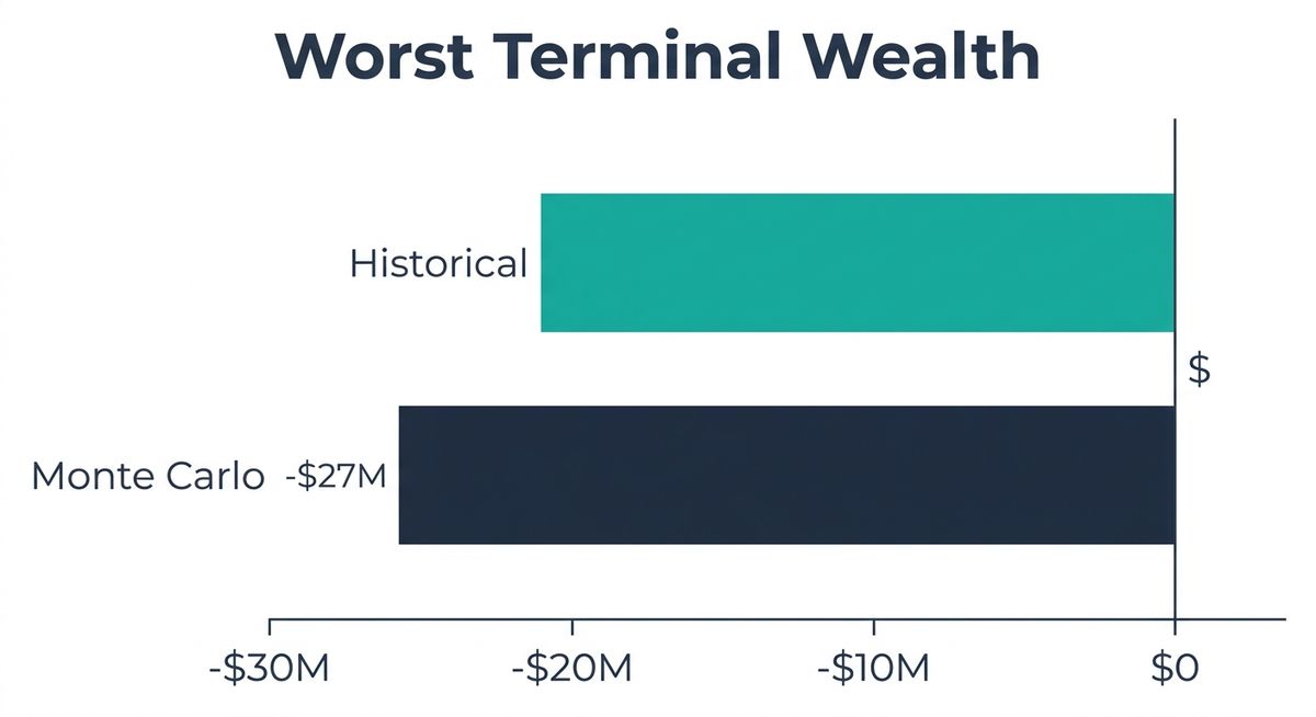
Negative twenty-seven million dollars. I don't know what your retirement plan looks like, but mine doesn't have a mechanism for owing the market a private island.
You can see the mechanism in the sequences themselves. The worst real 15-year run, the one starting in 1966, produced about −0.1% compound real returns over its first decade. Brutal, but punctuated by recoveries. The worst Monte Carlo run stacked bear market on bear market on bear market with no rebound at all, hitting −6.6% compound real returns and losing half its purchasing power in ten years. That sequence has never happened. Monte Carlo generates it anyway, then counts it against you.
Notice what this does to the usual criticism. People love to attack Monte Carlo for understating fat tails. For annual returns over retirement-length horizons, it's the opposite. It overstates extreme drawdowns. The problem was never the shape of the distribution. It's the assumption that each year doesn't know what last year did.
And the distortion gets worse when you lower your return assumptions, which is exactly what a lot of advisors now recommend. At an assumed 2% real return, half of all Monte Carlo scenarios come out worse than anything in the historical record. At 0%, it's 82%.
In practice, this means a 100% historical success rate lines up with roughly a 93.5% Monte Carlo score. Same plan, same data, different engine.
Overstating volatility risk can lead people to "wait too long to retire, and/or spend less than they really can." — Michael Kitces
Historical simulation has one more quiet advantage nobody talks about: it keeps the real relationship between returns and inflation intact. When 1970s stagflation shows up in a simulation, the lousy returns and the high inflation arrive together, holding hands, because that's how they showed up in life. Monte Carlo has to model that link on purpose, and often models it poorly.
What Counts as a Good Chance of Success Score
Here's where most people get their retirement success rate backwards: higher is not better.
The working consensus among planners:
| Score | What it means |
|---|---|
| Above 95% | Probably too conservative. You're underspending. |
| 80–90% | The target zone. |
| Below 70% | Your plan needs changes. |
T. Rowe Price's Retirement Advisory Service tells investors to aim for a "Confidence Zone" of 80% to 95%, and they say straight out that it's to stop people from making unnecessary sacrifices chasing a bigger number.
Every retirement plan is different, and what counts as a good score for your neighbor's portfolio might be the wrong target for yours. ReadyAimRetire lets you test how these different targets play out against your specific numbers instead of guessing from a general rule of thumb.
Why is 95%+ a warning light? Look at what chasing it costs you. Kitces modeled a couple, ages 66 and 64, with a $1M portfolio and $3,500 a month in Social Security:
| Target score | Monthly spending | Annual |
|---|---|---|
| 95% | $6,769 | $81,228 |
| 70% | $7,898 | $94,777 |
| 50% | $8,462 | $101,547 |
Same Spending, Nearly Identical Outcomes
The 95% plan spends $20,000 a year less than the 50% plan. When both plans were run forward through actual historical periods with sensible mid-course adjustments, median lifetime spending was almost identical.
In one historical period, the 95% couple eventually had to cut back to $5,380 a month. The 50% couple cut to $4,640. That's a 14% gap in the outcome, after starting 28% apart. Meanwhile the 95% plan finished with nearly three times the legacy the couple actually said they wanted to leave. It's the same trap behind why so many retirees die with too much money sitting in the bank instead of the life they said they wanted.
That's not safety. That's a decade of trips not taken. I've got a friend, Sal, who spent years telling me she'd see New York City "once things felt safe." She finally went at 71 and loved every minute, and the only thing she regretted was the waiting. Your dashboard can't feel regret on your behalf. That part's on you.
What Your Score Does Not Mean
Not a Probability of Ruin
A 15% failure rate does not mean a 15% chance of eating cat food. In none of those failing simulations does a real retiree keep pulling $8,000 a month while the balance hits zero, and then just keep going, whistling. Real people notice. They trim spending. They delay the new truck. They pick up part-time work. They downsize.
Kitces argues for relabeling the number entirely. Not probability of failure. Probability of adjustment. An 85% score means: in 15% of historical conditions, you would have had to change something. That is a completely different sentence than "you have a 15% chance of running out of money," and it should land differently in your chest.
One outcome can't prove or disprove the score. If the weather app says 90% chance of rain and the day comes up dry, most of us say the forecast was wrong. It wasn't. Kitces calls this the wrong-side-of-maybe fallacy. Probabilistic forecasts can only be judged across a lot of observations, and you get exactly one retirement.
The percentage hides the shape of the failures. Rob Berger makes this point well: a score doesn't tell you ending balances, and it doesn't tell you how badly the failures failed. Sixteen simulations that run dry at age 90 is a very different plan than sixteen that run dry at 78. Look past the number to the spread.
The score is only as good as what you fed it. This is Berger's sharpest point, and it applies to every engine equally. An 85% built on an optimistic spending estimate and an 85% built on a padded one look exactly the same on the dashboard. The market data is real. Your inputs are guesses. If your score moved and the market didn't, go check what you changed.
The Honest Limitations
Any tool that won't tell you this part is selling you something.
1. Your 106 simulations are not 106 independent tests.
The window starting in 1964 and the window starting in 1965 share 49 of their 50 years. They're nearly the same test wearing a different hat. Statistical work by Early Retirement Now suggests a set of overlapping 50-year cohorts really contains something closer to 3 to 10 genuinely independent observations.
That matters for how much confidence a high score has earned. After you observe 100% success:
| Effective independent observations | True success rate could be as low as |
|---|---|
| 10 | 74.1% |
| 6 | 60.7% |
| 3 | 36.8% |
Concretely: if the true success rate of your plan were 75%, and you had six genuinely independent observations, you'd still see a perfect historical record about one time in six, purely by luck. A 100% score is reassuring. It is not proof.
2. The middle of the record gets overweighted.
Because of how rolling windows work, years in the middle of the dataset show up in far more simulations than years at either end. Wade Pfau demonstrated this with 1926–2010 data and 30-year windows, which produce 56 simulations. Every year from 1955 to 1981 appears in 30 of them, the maximum any single year can hit. The years 1926 and 2010 appear in exactly one.
And those overweighted years happened to be a historic bond bear market: real returns on intermediate government bonds of −0.1%, versus 3.7% for years outside that stretch. So the method carries a built-in pessimism toward bond-heavy portfolios. Historical data suggests a bonds-only portfolio survives a 4% withdrawal rate only 38% of the time, which is stark enough to scare retirees into more equities than they actually need. Monte Carlo built on the same underlying data suggests 90%+ success is reachable with as little as 20% stocks.
3. No 50-year simulation begins after 1976.
Every simulation has to be complete, start to finish. You can't test a 50-year retirement starting in 1995, because 2045 hasn't happened yet. With a 50-year horizon, the most recent testable start year is 1976. That's it.
The consequence is worth sitting with: the dot-com crash and 2008 never show up as the opening years of any simulation. They appear in the middle and late portions of sequences, which is exactly where portfolios are toughest. Sequence-of-returns risk does its worst work in the first decade, and the two most recent major crashes are structurally locked out of that seat.
This is the best argument for not treating your score as a ceiling on caution. It's also why shorter plans get better recent coverage. A 30-year plan can be tested starting as late as 1996.
4. History is a sample size of one.
The deepest objection is also the simplest. The United States produced the best-documented equity returns of any major market over the period we're testing, and we're testing them on the one country that came through two world wars with its own soil untouched. Historical simulation can tell you what a plan survived. It cannot tell you what it will survive.
That's not a reason to prefer randomly generated returns, which are a model of history with extra assumptions stacked on top. It's a reason to treat 85% as a floor for thinking rather than a ceiling for worrying.
How to Actually Move Your Score
The score responds to a handful of levers, roughly in order of horsepower. Start by modeling your own retirement at ReadyAimRetire so you can see which of these actually moves your score, rather than guessing at the effect.
🎯 Levers That Actually Move the Score
- Delay Social Security. Every year you defer past full retirement age, up to 70, adds roughly 8% to a guaranteed, inflation-adjusted, longevity-proof income floor. Nothing else in the plan does this. Nothing.
- Trim the first five years of spending. Sequence risk is front-loaded. A modest cut in years 1 through 5 moves the score way more than the same cut in years 20 through 25.
- Build flexibility in on purpose. Model a rule that trims spending 10% after a bad year instead of a flat inflation-adjusted withdrawal forever. This is what real retirees do anyway, and it converts failures into adjustments.
- Work part time for two or three years. Even small earned income early in retirement takes pressure off the portfolio during its most fragile window.
- Revisit allocation, carefully. Too little equity hurts (inflation over 50 years is no joke) and too much hurts (sequence risk). Change this one last, and look at the failing scenarios instead of the headline score. Keep the bond bear market bias from Limitation #2 in mind before you decide bonds are the villain.
- Shorten the horizon honestly. Planning to 92 versus 100 changes both the simulation count and the score. Pick a real number, not a maximally defensive one.
After each change, look at which simulations flipped. If your failures are still bunched up in 1929 and 1966, you bought general safety. If they've scattered, you changed the character of the plan itself. Those are different things.
Why the Method Matters Right Now
You don't need me to argue in theory that methodology drives the answer. There's a live example sitting right there.
Bengen — Historical (2025)
4.7% safe withdrawal rate. Testing every 30-year period since 1926, reporting what survived the worst one, across a diversified set of asset classes.
Morningstar — Monte Carlo (2026)
3.9% safe withdrawal rate. Forward-looking projection from current bond yields and equity valuations at a 90% success target, 30–50% equities.
Same question. Answers about 20% apart.
Let's be precise about why, because it's two things, not one. Part of the gap is portfolio construction. Bengen's diversified mix and Morningstar's conservative equity band are not the same portfolio, so of course they don't behave the same. But part of it is pure method. Bengen asks what the worst thing that ever happened would have done to you. Morningstar asks what a model of the future says might happen. Those two questions give different answers even if you hold the portfolio identical.
Here's the fun part. On the flexible-spending side, the two camps converge more than the headlines suggest: Bengen puts flexible retirees at 5.25% to 5.5%, Morningstar at roughly 5.7%. Both methods agree that your willingness to adjust is worth more than the choice of engine.
The number is a property of the model as much as it's a property of your plan. Swap the engine and it moves without you touching a single input.
So no, that 85% Chance of Success score is not a verdict. It's the start of better questions.
Go open your plan and find the failing scenarios. Note what years they start in. Ask how late in retirement the money actually ran out, and what a 10% spending cut in year three would have done about it. Then run the same plan through a Monte Carlo tool and compare the two.
If the engines roughly agree, you've got real confidence. If they disagree sharply, congratulations, you just found out exactly where your plan is fragile. That's worth a whole lot more than any single percentage on a dashboard.
Test Your Own Chance of Success Score
Thanks for reading if you made it this far. Peace!